A place to continue discussions started in class or start new ones.
Friday, April 30, 2010
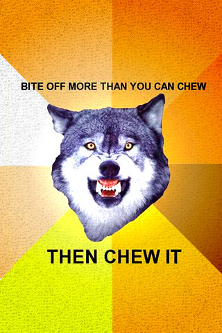
Courage Wolf.
Which of the three appeals does this picture use? Is it effective? How does the composition of the piece, (colors, text placement, etc.) contribute to the picture's objective?
Must...resist...urge...to make...Legend of Zelda reference...
So, serious analysis time.
I reckon that the picture uses quite a lot of Pathos. The colours are bright and vibrant and hit the eye, causing the casual passerby to stop and stare.
Orange, red, and yellow are generally considered warm colours, they're assossiated with couarge, the side of good, strength, and perseverance in our culture, and they are displayed in this image to provoke a sense of motivation.
The quote also serves this purpose as it proudly shouts to the world our American attitude of, "FAILURE IS NOT AN OPTION" and "If you can't do it, do it anyway, and if you fail, DO IT AGAIN!"
The wolf itself is a symbol of endurance through hardships and strength, qualities Americans tend to respect.
This picture uses pathos by using the colors and the wolf to attract the attention of people. The fact that the vibrant colors our coming out of the wolf's head in like an angle makes the wolf seem as though its coming at you, which captures your attention. The thing that caught my attention was the fierceness of the wolf's face. It made the quote stand out so much more because it was like man! That wolf looks like he's in charge, I wanna be like that!
The picture uses pathos through bright colors, hoping to catch the eyes of people. By using such a fierce animal like a wolf, the statement bite off more than you can chew really means something and calls the attention of people.
Also, the eyes of the wolf really pops among the colors- and looks like he is staring right at you!
This definitely uses a lot of pathos, because it wants the audience to feel courageous and proud. The colors contribute to this because they are all warm colors, which overall show a fierce, brave quality and bring out those emotions in the audience. The picture stands out and would definitely attract the attention of someone who was walking by. The toughness of the picture also appeals to people, and people would feel like "yeah I'm tough!" when they read it. Also, the colors attract attention because they are very bright and demand the attention from the audience. The picture would not be as effective if it had soft pastel colors, because that would not give the appearance of a bold, brave, and determined person. The colors and text placement are a huge part of the overall appeal of the picture and contribute to the picture's objective by using the right tone to fit the overall purpose of the picture.
The change in text size between the first part and the second, emphasizes the rebelious nature of this statement. It's going against the commmon phrase "DONT bite off more than you can chew" and the change in size helps show this.
As the saying say you got to do what you got to do. If you are able to chew of more than you can chew you should be able to force yourself to be the exception and and not fall to the social samenes that holds our generation in a vice
The picture uses pathos in the colors that were used in it. The colors were very vibrant which makes you stop and stare and really look at what it says, it catches your eye fast. The wolf is very much in charge, and the brightness in the wolf makes it seem powerful over all. It's kinda like the wolf is yelling at you, staring you down, intimidating you.
The ad makes very obvious appeals through tools such as the symbol of the wolf and the phrase. The ferocious looking wolf that is the focus of the ad gives off the feeling of power, confidence, and control, creating a pathos appeal in the person's mind to want to be like that. The phrase also uses a clever statement in order to not only encourage a person to do more than they think they can, but to give the feeling that it is quite possible and in fact easy to exceed these limitations. It also uses more subtle appeals through the color choice. The use of bright and similar colors creates both an attractive and optimistic inspiring tone to the ad. The way the colors grow as the come out also gives off the effect of coming at the viewer, catching their attention.
8 comments:
Must...resist...urge...to make...Legend of Zelda reference...
So, serious analysis time.
I reckon that the picture uses quite a lot of Pathos. The colours are bright and vibrant and hit the eye, causing the casual passerby to stop and stare.
Orange, red, and yellow are generally considered warm colours, they're assossiated with couarge, the side of good, strength, and perseverance in our culture, and they are displayed in this image to provoke a sense of motivation.
The quote also serves this purpose as it proudly shouts to the world our American attitude of, "FAILURE IS NOT AN OPTION" and "If you can't do it, do it anyway, and if you fail, DO IT AGAIN!"
The wolf itself is a symbol of endurance through hardships and strength, qualities Americans tend to respect.
This picture uses pathos by using the colors and the wolf to attract the attention of people. The fact that the vibrant colors our coming out of the wolf's head in like an angle makes the wolf seem as though its coming at you, which captures your attention.
The thing that caught my attention was the fierceness of the wolf's face. It made the quote stand out so much more because it was like man! That wolf looks like he's in charge, I wanna be like that!
The picture uses pathos through bright colors, hoping to catch the eyes of people. By using such a fierce animal like a wolf, the statement bite off more than you can chew really means something and calls the attention of people.
Also, the eyes of the wolf really pops among the colors- and looks like he is staring right at you!
This definitely uses a lot of pathos, because it wants the audience to feel courageous and proud. The colors contribute to this because they are all warm colors, which overall show a fierce, brave quality and bring out those emotions in the audience. The picture stands out and would definitely attract the attention of someone who was walking by. The toughness of the picture also appeals to people, and people would feel like "yeah I'm tough!" when they read it. Also, the colors attract attention because they are very bright and demand the attention from the audience. The picture would not be as effective if it had soft pastel colors, because that would not give the appearance of a bold, brave, and determined person. The colors and text placement are a huge part of the overall appeal of the picture and contribute to the picture's objective by using the right tone to fit the overall purpose of the picture.
I also wanted to add...
The change in text size between the first part and the second, emphasizes the rebelious nature of this statement. It's going against the commmon phrase "DONT bite off more than you can chew" and the change in size helps show this.
As the saying say you got to do what you got to do. If you are able to chew of more than you can chew you should be able to force yourself to be the exception and and not fall to the social samenes that holds our generation in a vice
The picture uses pathos in the colors that were used in it. The colors were very vibrant which makes you stop and stare and really look at what it says, it catches your eye fast. The wolf is very much in charge, and the brightness in the wolf makes it seem powerful over all. It's kinda like the wolf is yelling at you, staring you down, intimidating you.
The ad makes very obvious appeals through tools such as the symbol of the wolf and the phrase. The ferocious looking wolf that is the focus of the ad gives off the feeling of power, confidence, and control, creating a pathos appeal in the person's mind to want to be like that. The phrase also uses a clever statement in order to not only encourage a person to do more than they think they can, but to give the feeling that it is quite possible and in fact easy to exceed these limitations. It also uses more subtle appeals through the color choice. The use of bright and similar colors creates both an attractive and optimistic inspiring tone to the ad. The way the colors grow as the come out also gives off the effect of coming at the viewer, catching their attention.
Post a Comment